Pulse
A health app that explains your Apple Watch data against your own history, not a generic score, with an AI coach you can ask about it.
Why I built it
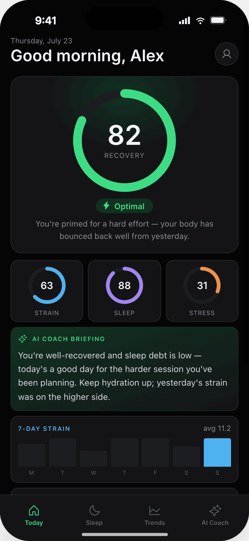
My Apple Watch collects a ton of data, but Apple Health never really explains what any of it means. I built Pulse to close that gap: it tells you plainly whether today is normal for you, judged against your own history rather than a generic score, and says so honestly when there isn't enough data to know yet. It started with Apple Watch, but it's built to grow into other wearables from here.
How it's built
React Native + TypeScript client reading HealthKit on-device; Supabase Edge Functions handle normalisation, rolling baselines and delta detection, with Postgres (RLS-scoped per user) for time-series aggregates behind one shared typed contract.
01 · Context
Pulse is a product I designed, built and shipped alone. It reads Apple Health data written by a watch and answers one question well: is today different from my normal, and by how much?
The idea came from watching what WHOOP and similar wearables do with their data (real insight, not just a dashboard of numbers), and wondering why I couldn't get anything like that out of my own Apple Watch. I already had months of data sitting in Apple Health that never really explained itself, so I built Pulse to close that gap: something that told me plainly whether today was different from my normal (judged against my own history, not a generic benchmark) and that said so honestly when there wasn't enough data to be sure yet. Apple Watch was the obvious place to start since it's what I wear every day, but "is today different from my normal?" isn't a question that belongs to one device: Pulse is built to grow into other wearables from here, and I wanted a product where I owned every decision end-to-end, from the data model to what the app is and isn't allowed to say about your health.
02 · What I owned
Everything. The interesting problems weren't in the UI, though, they were in the data.
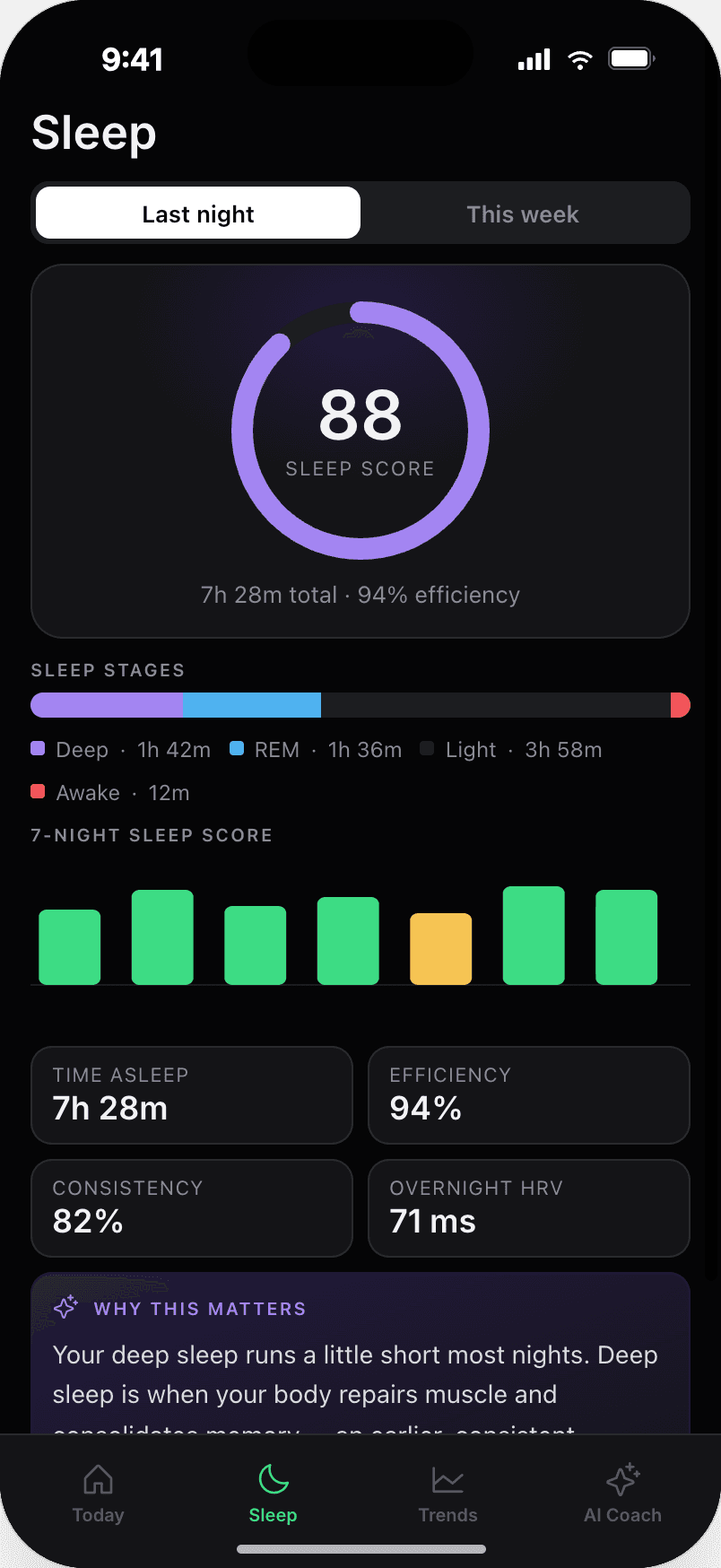
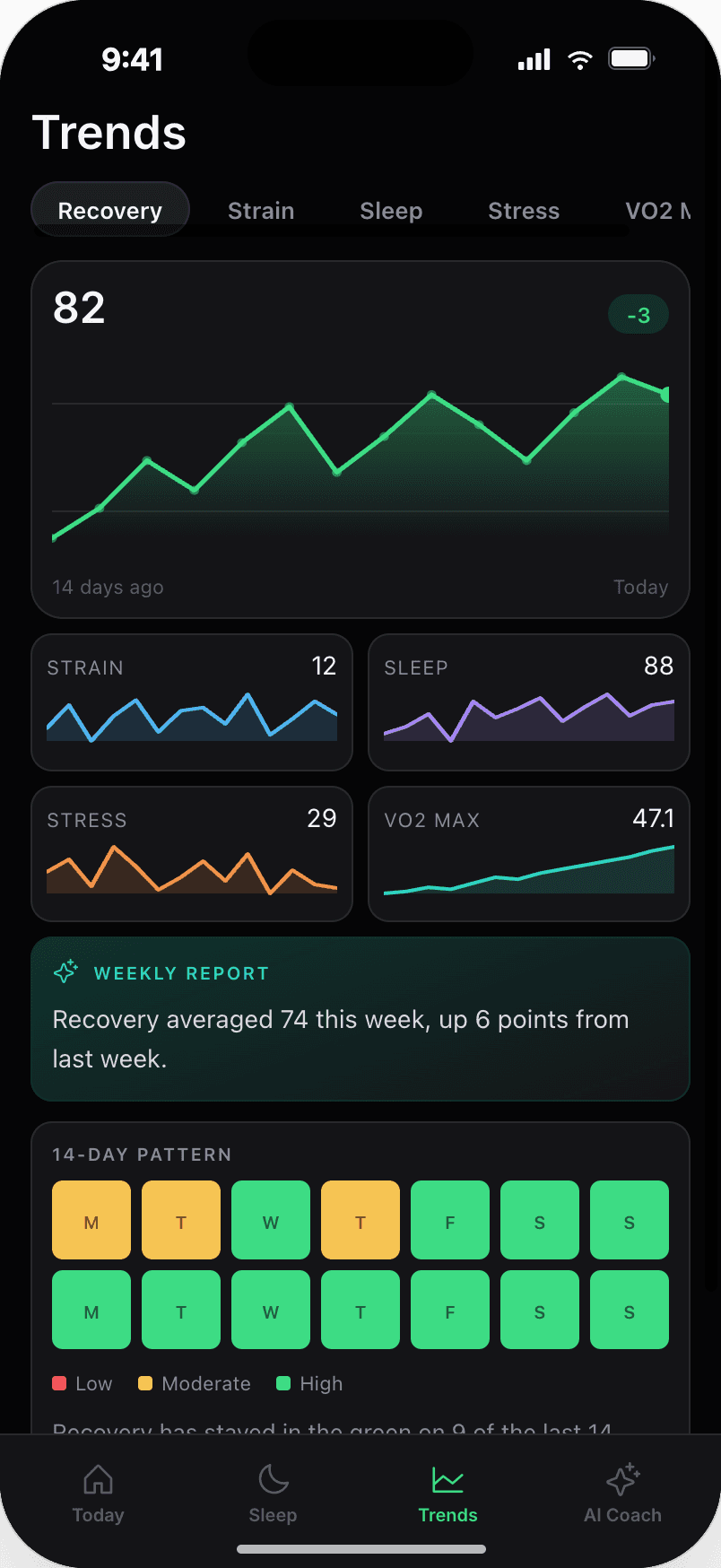
Apple Health hands you raw heart rate, sleep and workout samples with no meaning attached. Normalisation and baselining turn that into metrics like recovery, strain and stress, and into aggregates the Coach can reason over to answer questions.
Instead of faking a score, the app says it's still collecting data until it actually has enough history to speak with confidence. That reads as competence, not failure: a design problem as much as an engineering one.
A fixed vocabulary of what the app may assert, reviewed against what consumer sensors can actually support. No diagnosis, no advice, no implied causation.
03 · System design
The client is a thin, offline-tolerant renderer. Raw samples never leave the device unless the user opts into sync; what syncs are normalised daily aggregates. Supabase Auth issues the client its identity, an Edge Function validates and ingests the payload, and a scheduled worker owns rolling 14- and 60-day baselines and delta detection, writing derived aggregates to Postgres so the app can open to a populated screen with no round-trip.
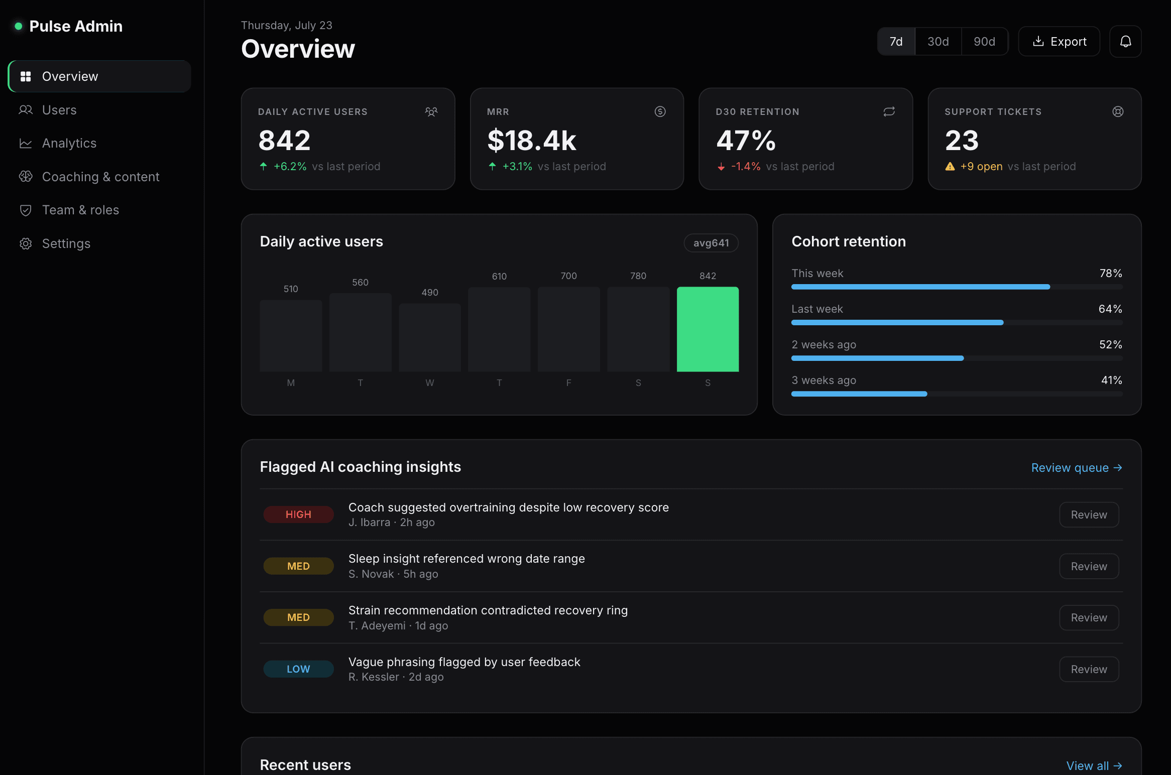
Two decisions carried the design. First, computation lives server-side even though it could run on-device: I wanted to change a baseline definition without shipping a build and stranding older clients. Second, aggregates are immutable and versioned: when the algorithm changes, old rows stay, new rows are tagged, and I can prove why a chart looked the way it did last month. Row-level security on every table means the database itself enforces that a user can only ever read their own rows: the same guarantee holds whether the query comes from the app or the admin dashboard.
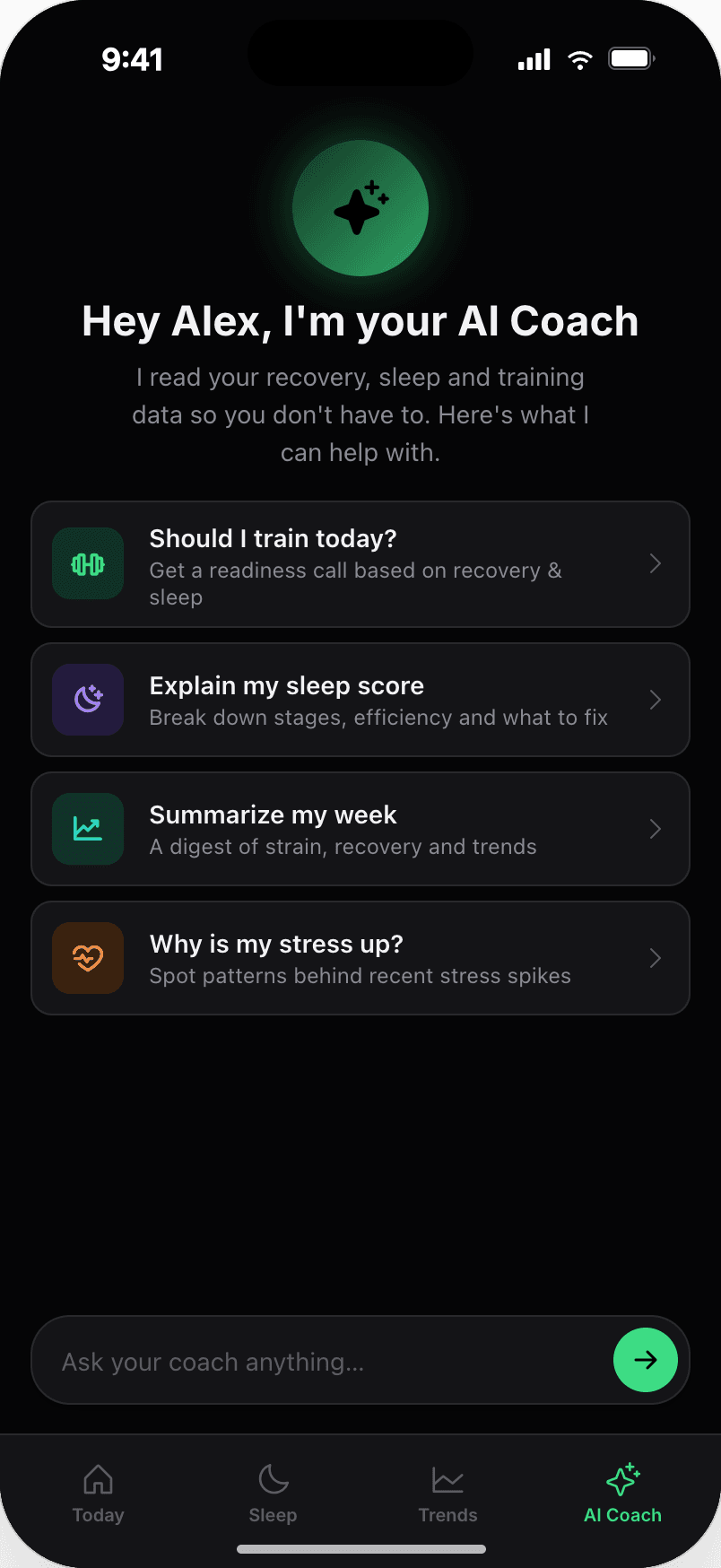
The Coach screen follows the same pattern: coaching behaviour is data, not code. Copy and tone rules live in a coach_instructionstable that I edit from the admin dashboard (never hard-coded in the client) so I can retune what the coach is allowed to say without a build. When a message is sent to the coach, a Coach Edge Function reads those instructions alongside the user's current aggregates and calls the Claude API to generate the reply; the model never sees raw HealthKit samples, only the already-computed baseline and delta.
coach_instructions straight to Postgres, no separate function on that path04 · Stack & tooling
One typed contract, defined once as Zod schemas and shared by client and service, so a shape change breaks the build rather than a chart. Reanimated for the chart interactions; EAS for over-the-air builds to a handful of testers.
05 · Process & trade-offs
I ran it like a startup with one employee: a two-week loop, a written decision log, and myself as the only user I had to convince. Every release had to answer "what did we learn?" Features that couldn't answer that got cut.
Apple Health only in v1. Supporting every device would have tripled the normalisation surface before I knew which metrics I actually trusted day to day. Health Connect is a known, scoped follow-up rather than an open question.
Deliberately dumb scoring: rolling baselines and z-scores instead of a model. Slightly less clever, but every number on screen is explainable in one sentence, which is the entire point of the product.
The build itself followed a fixed pipeline rather than jumping straight to code: Claude for product thinking, Claude for the visual design, Claude Code for implementation, and Expo Go on a real device to close the loop back to product truth.